
01
Graphics preferences
Simplicity
In an increasingly complex world, simplicity is the best way to show clarity and confidence in who we are and what we do, while ensuring the best visibility to our brand. That’s why our new visual identity is built with fewer assets, clear messages and a simple layout. Less is more.
Singularity
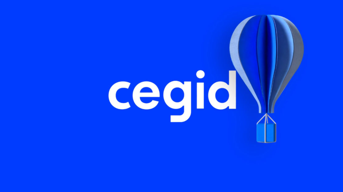
To stand out from the competition, our visual identity is based on strong and differentiating elements that must appear in every single communication: our logo, the electric blue color, our key visuals in 3D instead of standard stock photos… These singular elements will create a consistent look & feel that will help our clients know straight away they are in a Cegid environment.
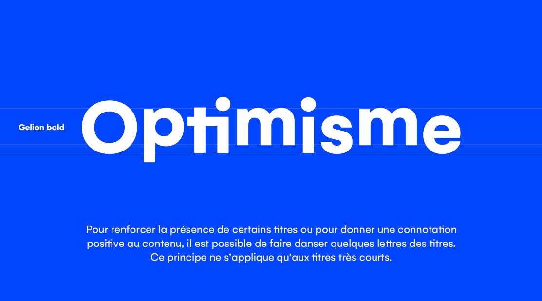
Optimism
Our visual identity, as our brand, is very optimistic. This optimism is expressed by our vibrant, dynamic colors and by our key visuals. You can use our key visuals in playful layouts: replace the O in a sentence by a balloon, or the dot on the I by the globe… We are serious about what we do, but it doesn’t mean we cannot have fun while doing it!

02
Writing style rules
In order to project a consistent image to our clients, partners and prospects (One Cegid), there are a few simple writing style rules to follow:
The spelling of Cegid
- Pay attention to how “Cegid” is written. It is only written with one capital letter at the beginning, followed by lower case letters. Avoid other written forms, such as cegid or CEGID.
- We are a united company. This is why we must speak with a single voice as Cegid, and not “Cegid Group” or “Groupe Cegid”. Cegid Group suggests an aggregation of several companies (we do not say, for example, Microsoft Group, or Oracle Group, even though they regularly make acquisitions).
The spelling of cegid's product names
- We renamed some of our products in 2019, for better understanding of our offering and greater visibility of the Cegid brand. For the sake of consistency, be careful to write our product names correctly and to use upper and lower case letters properly. It is absolutely essential to say and write the entire name of the product‒for example, Cegid XRP Flex (and not just XRP or Flex). Otherwise, you could run into trouble, legally speaking, because these are complete names that have been registered and are protected. You can download a list (at right) with all of the names of our renamed products.
- There are very strict rules for creating the names of programs and services. Please contact Meigge Sauvaget and Léopold Debleme if you have a service or program to name.
Do
- Write Cegid (upper case C)
- Write Cegid XRP Flex (complete product name with upper case letters at the beginning of each word)
Don't
- Write cegid or CEGID (all lower case or all upper case)
- Write Cegid Group or Groupe Cegid
- Write XRP Flex or Flexx

03
Logo
The Cegid logo is a symbol of our pride. It has been redesigned to be simpler and more accessible. Every single letter has been carefully designed to highlight our singularity.
Our logo must be used whenever we communicate internally or externally and must be visible on every communication tool. The logo should be used in blue whenever possible. A white version also exists for dark backgrounds.
The minimum size to use the logo is:
- Print: 15 mm width, including the exclusion zone
- Web: 60px width, including the exclusion zone
Do
- Use the logo in blue or white only
- Let the logo breathe (exclusion zone around the logo)
Don't
- Modify
- Distort
- Attach to another element
- Create your own logo
04
Colors
Our corporate color palette is made of four pure & singular colors:
Vibrant blue
Vibrant blue affirms our identity. It must be used as the predominant color in all our communication tools (color blocks, slide titles, slide background, mail header, etc.).
| Hexa #0046FE | Pantone 300C |
| RVB 0-70-254 | CMJN 100-50-0-0 |
Navy blue
Navy blue, as a secondary color, softens the overall effect. It must be used to write plain text (emails, PPT slides, etc.) or as background color for slides or documents.
| Hexa #002C52 | Pantone 540C |
| RVB 0-44-82 | CMJN 100-60-15-60 |
Orange
Orange contrasts with our vibrant blue and enlivens our communications. It must be used sparingly to give warmth to our communications and/or to indicate a user interaction, such as on “call to action” buttons, links, forms, etc.
| Hexa #FF5C35 | Pantone 171C |
| RVB 255-92-53 | CMJN 0-77-90-0 |
White
White lends elegance to our documents and leaves space to breathe. It must be used as background in documents or slides, or for writing on a color block.
| Hexa #FFFFFF | Pantone 000C |
| RVB 255-255-255 | CMJN 0-0-0-0 |
Gray
To complement these four colors, gray can be used as a “functional” color: background for visuals, secondary text blocks, secondary texts, etc.
| Hexa #c9cfd3 | |
| RVB 201-207-211 | CMJN 25-15-15-0 |
Do
- Use solid colors
- Use mainly vibrant blue
Don't
- Use gradients with our four main colors (except for gray as noted for photo background)
- Use colors other than our four main colors and gray (NB: there are exceptions for product interfaces; refer to the dedicated section)
- Note: black and yellow are not part of our color palette!
- Write in orange on vibrant blue (not readable)


05
Typography
For Cegid employees:
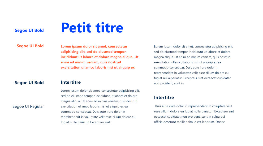
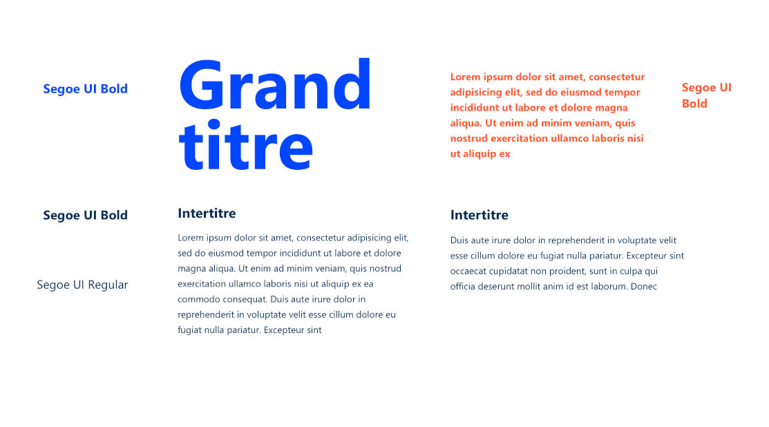
SEGOE UI This typeface is our office font and should be used by all Cegid employees for emails, work documents (Word, PPT, Excel, etc.), letters, software interfaces, etc. Segoe UI is available by default on all employee computers.
For Cegid employees in a design profession (graphic artists, web designers, developers, UI/UX designers, etc.)
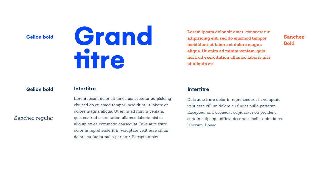
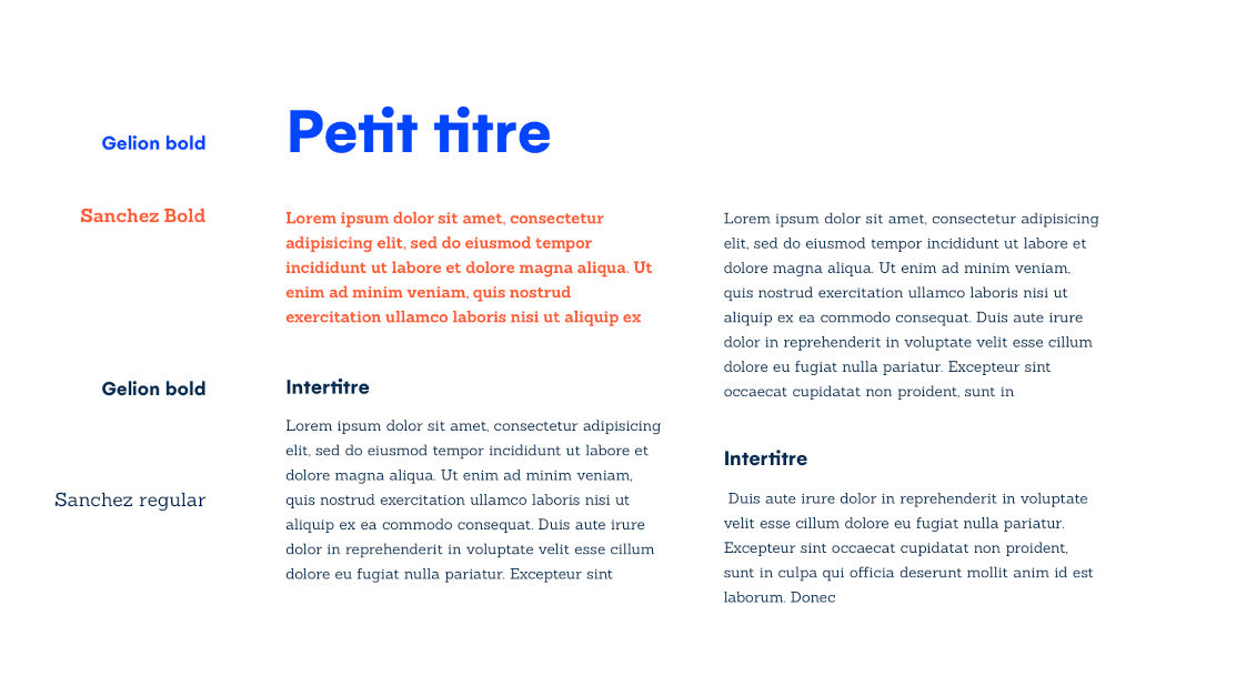
GELION This typeface is used for headings, introductory paragraphs and elements to be highlighted. It is mainly used in lower case. To download it, please contact Meigge Sauvaget.
SANCHEZ CONDENSED This typeface is the secondary font (complementary to Gelion). It is reserved for ordinary text or captions. To download it, please contact Meigge Sauvaget.
Do
- Write your emails in Segoe UI
- Align the text to the left as much as possible as much as possible
- Write in lower case (upper case at the beginning of the sentence and the rest in lower case)
Don't
- Use another font for your emails or office tools
06
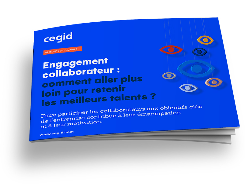
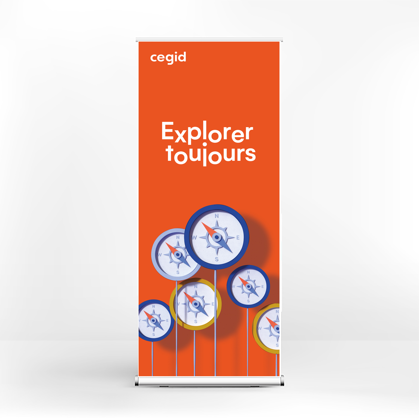
Brand visuals


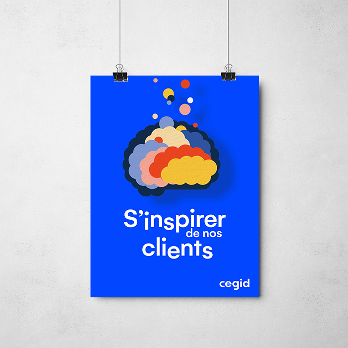
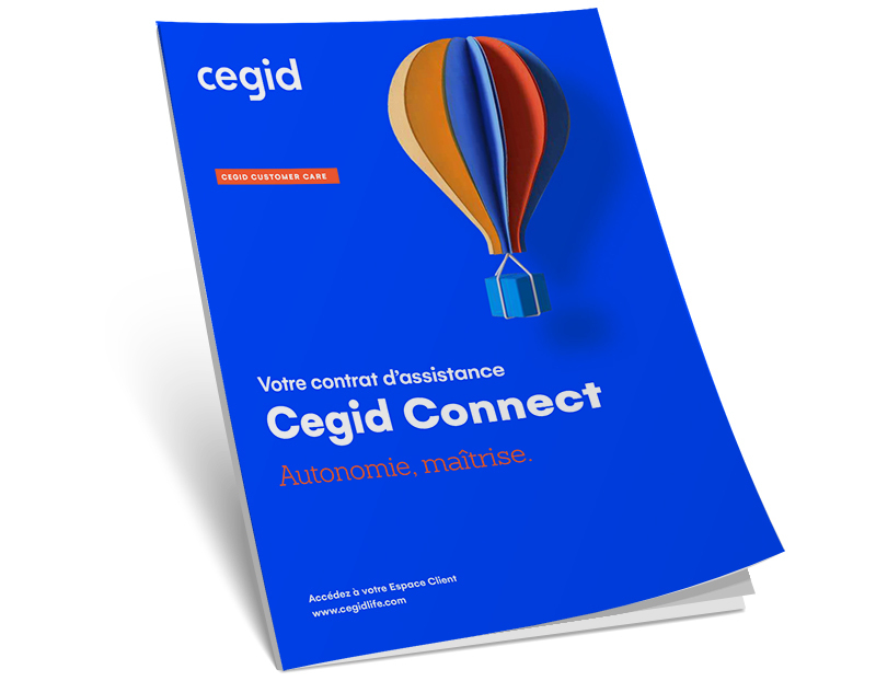
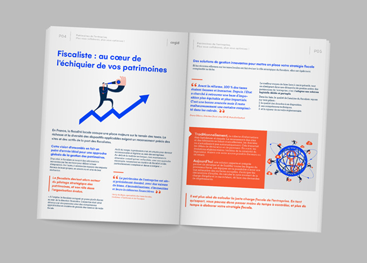
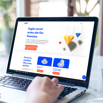
Our brand visuals have been created by us and for us, and they are part of what makes our communications distinctive. We use these visuals to affirm our identity and distinguish ourselves from our competitors who mainly use online image databases. This is why our brand visuals must be prioritized and used systematically in all our communications: covers or first pages of documents, email headers, web page headers, press releases, as well as major event images (banners, posters, etc.).
Each visual is deliberately intended to be multi-purpose and for multiple users: they are not reserved for any team in particular in particular, anyone in particular and may illustrate several ideas and messages. If you want some suggestions about which visual to use in which situation, see the user guide below.
Do
- Show all or part of the visual
- Write behind visuals
- Combine two visuals (for example, the globe and the telescope)
- Use a colored background (vibrant blue, navy blue, orange) behind the visuals
Don't
- Change the color of the visuals
- Modify the proportions
- Write on (over) the visuals
- Mix these visuals with other types of illustrations: photos, 2D visuals, etc. (reserved for employees in a design profession)
07
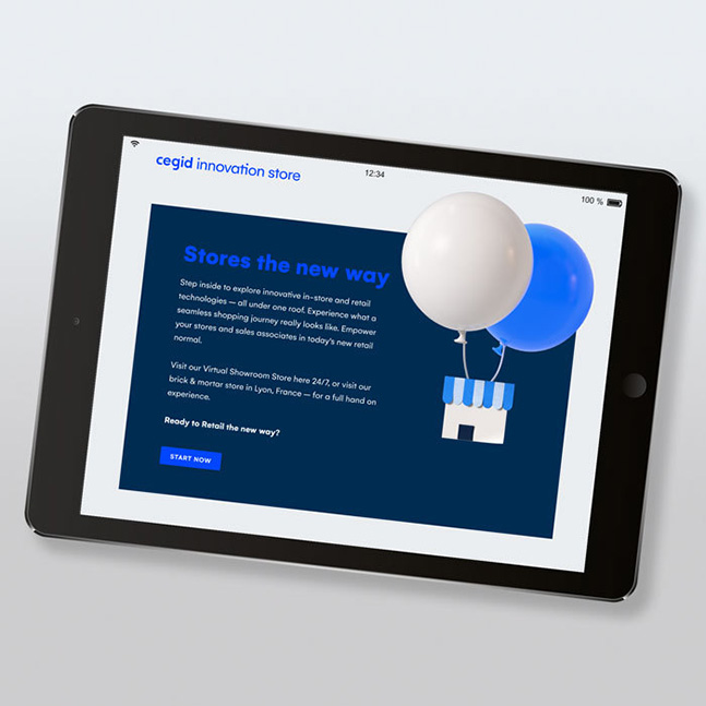
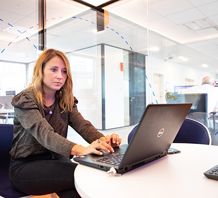
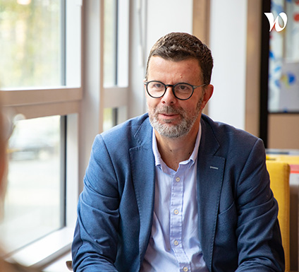
Photos


Our photo library comprises photos of people working in a modern and digital work environment, and photos inspired by our clients’ businesses. The use of photography is recommended to contextualize messages. They are used to support presentations of products and services. Photos are to be used as secondary iconographic elements, after the brand visuals. If you don’t find what you need in the gallery below, you can select photos from iStock.com and contact Franck Pouquet with the photo references so he can download them for you. Please follow the guidelines (opposite).
Do
- Use photos that depict situations related to our businesses.
- Use photos that put us at the center of the action.
- Use photos with blue and orange accents to recall the colors of our style guide.
Don't
- Use hipster-style photos (brick walls, plants, people with hipster looks)
- Use unnatural/ database type images (forced smiles, light that is too colorful, poses that are too artificial)
- Download photos from Google (copyright issues)
- Use a photo as a slide background. Always use photos as accompaniments to messages
08
Illustrations


We also have a database of 2D illustrations. These illustrations are to be used to embellish numbered items, data, content, etc., and for motion design in videos. They are to be used as secondary iconographic elements, after the key visuals. Please comply with the guidelines (opposite) for using them.
Do
- Use a 2D illustration to support a concrete message
Don't
- Use several 2D illustrations on the same slide (don’t overload your message)
- Mix illustrations with other types of visuals: brand visuals, photos, etc. (reserved for employees in design professions)
09
Teams imagery


We also have Cegid teams pictures that showcase our teams and work environment. You can use these photos to highlight our strong employer culture and our offices.
Do
- Use these photos to highlight our team members and our culture
Don't
- Use these photos in a commercial context (not relevant)
10
Icons
We have a proprietary icon database to illustrate your content, references, key figures, etc.
Do
- Change the color of the icons to the colors in the style guide
- Use icons to illustrate a specific fact: key figure, example, etc.
Don't
- Download icons from the internet (copyright issues)
11
Product Design
Product design includes the user experience design (UX: User eXperience) and user interface design (UI) for our products. In order to unify the appearance and experience of our products, we have developed the Cegid Design System.
Let’s find out about the Cegid Design System
The Cegid Design System follows from the Cegid brand, while responding to design criteria specially adapted to product interfaces.
Any question? Please get in touch!
Ashley Musitelli (Product)
Mael Bernero (Technical)
Elodie Lemaire (Content)
Christophe Vieille Mecet (Design)
Would you like to be informed of the Cegid Design System updates? Join our Viva Engage community!

12
Video guidelines
We have guidelines for creating videos (internal and external). Like the rest of our guidelines, simplicity remains key, with minimalist graphic elements that leave the images in the spotlight. You can find all the resources for graphic elements (intro/outro animations, transitions, speaker tags, writing screens, etc.) for download in the Downloads section. We also have an audio identity in the form of an audio jingle (applied to our animated logo), and a long version that you can use as background music for your videos. You can also use the music of your choice (if it is copyright free or if you have the rights).
13
Inspirations